Microsoft Global hackathon 2025
Adaptive Digital Cookbook
Helping young adults with special needs cook independently through step-by-step, visual guidance.
Team
2 Designers, 2 Product Managers, 6 Engineers
My Role
Product Designer
Timeline
September 15 – 22 (1 week)
Tools
Figma, Slack, Notion

Summary
In less than a week, I designed a mobile-friendly digital cookbook for Rise DC, a nonprofit that supports young adults with special needs. I explored multiple directions and used AI tools to accelerate iteration.
The goal of the project was to digitize Rise DC’s existing adaptive physical cookbook and create a more accessible, scalable way for participants to learn important life skills, such as cooking.
My Contributions
Led the design of two core features: Interactive recipe tutorials & creating recipes
Owned the adaptive cookbook experience end-to-end
Collaborated with another designer on the recipe creation feature
Main Impact
Increased inclusivity for users with various literacy levels
Reduced cognitive overload through one-step-at-a-time interactions
Tested the developed app live with Rise DC participants
The Challenge
Translate Rise DC’s adaptive physical cookbook into a digital experience that supports simple, accessible learning for users with diverse literacy levels without overwhelming them.
Simple & Engaging Recipe Tutorials
Built-in Parental/Guardian Support
Interactive Recipe Creation
Background
Our Users
Include young adults with special needs
Have literacy levels ranging from non-reader to kindergarten level
Are supported by Rise DC staff, parents, and guardians
Their Frustrations
Traditional recipes:
Rely heavily on text
Present too many steps at once
Lack visual guidance
The Problem with Rise DC's Current Solution
Adding new recipes to Rise DC's physical adaptive cookbook is time-consuming and costly
The format isn't scalable, and updates require printing and laminating new pages
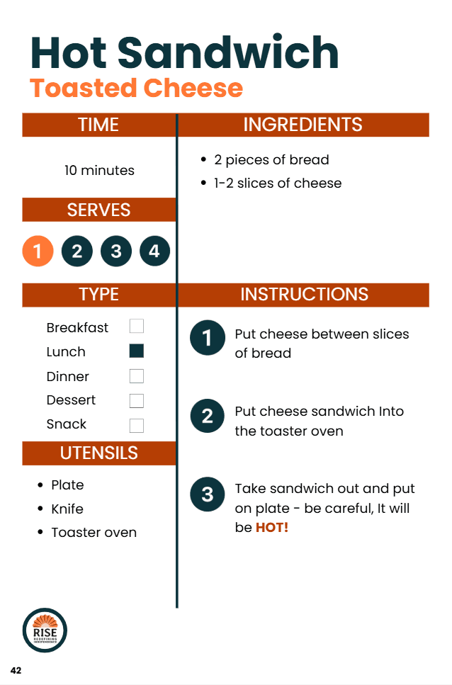
Prototype of Rise DC's Adapted Recipe
Key Design Goals
Support independence through guided, step-by-step cooking
Reduce cognitive overload
Ensure accessibility for users with varying abilities
Research & Constraints
I worked closely with stakeholders at Rise DC to understand:
Where participants struggled most
How instructions should be paced
Accessibility needs beyond basic WCAG compliance
The Main Takeaway
Participants do best with one-step-at-a-time instructions. Seeing too much information at once is overwhelming.
Design Exploration
Exploration #1: Information-Dense Layouts
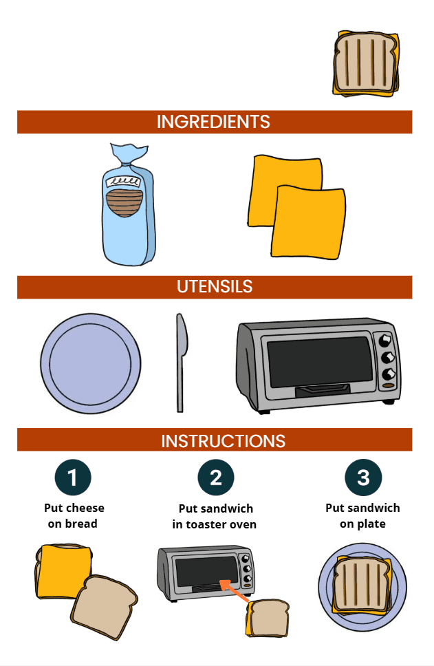
I first experimented with a more compact, text-heavy layout that reduced scrolling and screen space. However, nonprofit feedback and user needs emphasized that visuals weren’t just helpful, but necessary. I iterated toward a visual-first approach, using imagery to support key information like utensils and ingredients.

Exploration #2: Multiple Interaction Modes
I also explored mode toggles to offer more customization and better adhere to varying literacy levels. However, this added complexity across multiple user roles and expanded the scope beyond what we could realistically support. This feature wasn’t a no, just a not right now since our priority was getting the app to development and into users’ hands.
Exploration #3: AI Powered Assistance
Other ideas like AI-suggested recipe inputs, image search during recipe creation, and a GIF library for more engaging guidance weren't feasible. It was difficult to introduce AI features without risking privacy, autonomy, and trust, so I documented these as future opportunities rather than rushing them into the experience.
AI to Accelerate Iteration (with Human Judgment)
Customizing individual components in Figma was tedious and time-consuming, so I used Gemini AI to speed up the process and reduced my task time by ~80%.
Prompt: "Replace the plate images and text with other appliances and utensils for my cookbook app for kids with special needs. Keep the image and text styles and size consistent."

Before
After
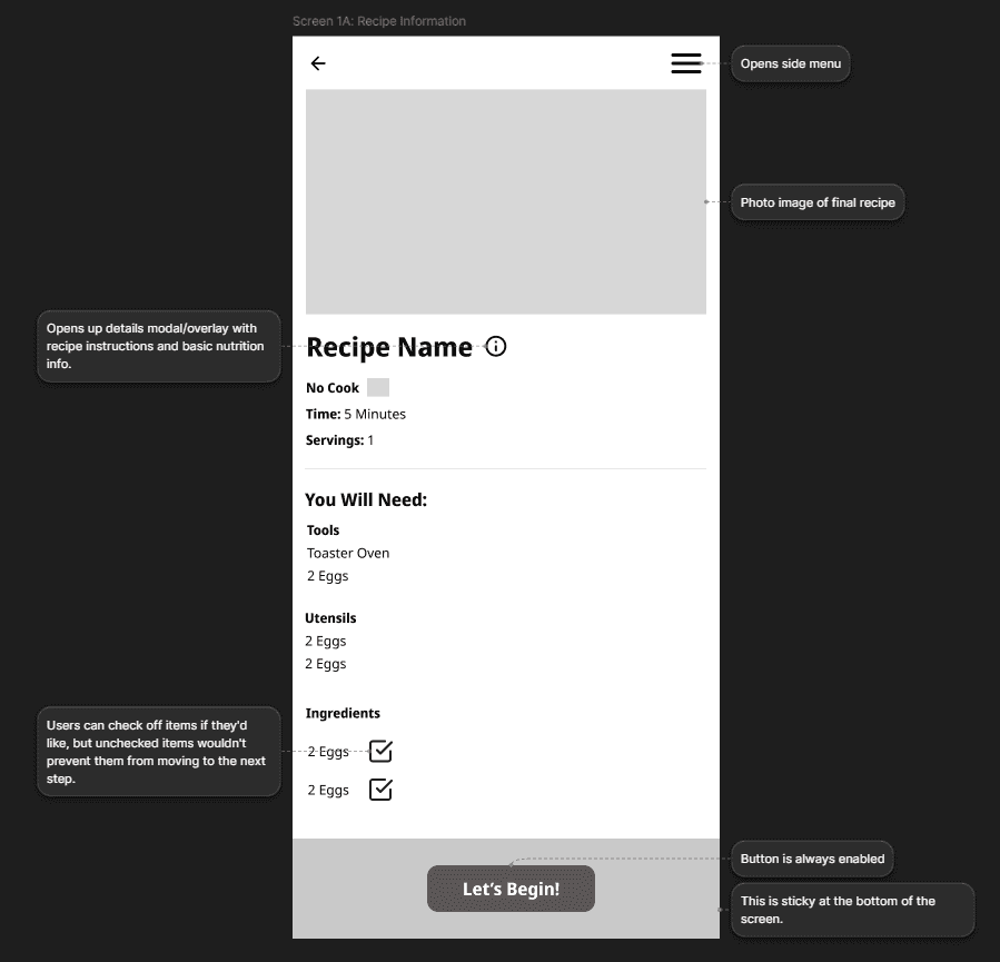
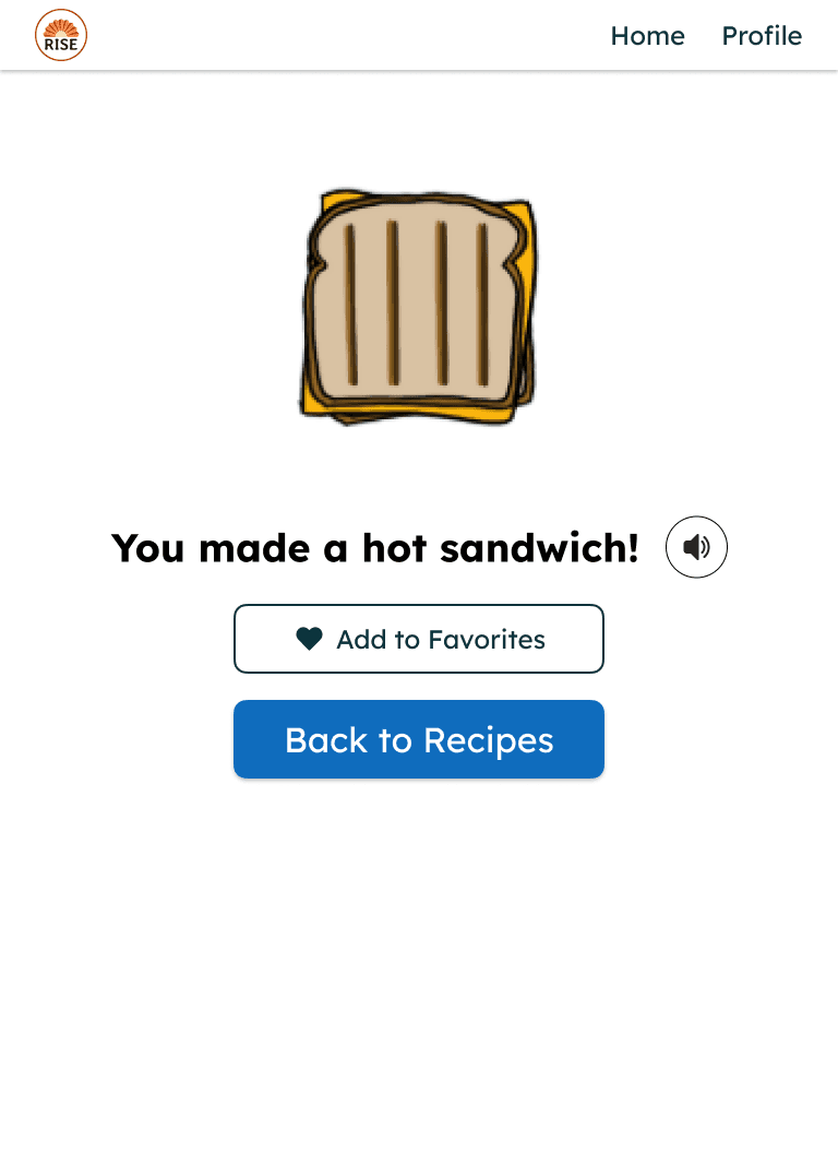
Feature 1: Simplified Recipe Tutorials
Since listing all recipe steps on one page was causing confusion and overload, I designed an interactive, step-by-step recipe tutorial that guides users through cooking one action at a time.
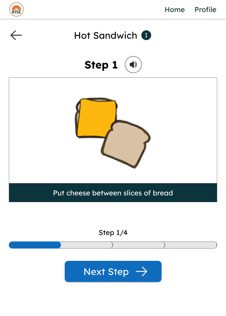

Key Design & Accessibility Decisions
One step per screen to reduce cognitive load
Large touch targets for mobile accessibility
Gamified UI for maximum contrast and color clarity (validated using Figma plugins), ensuring accessibility and user engagement
Text-to-speech option so users can hear instructions aloud
I experimented creating animations with Figma Make (Click to Interact)
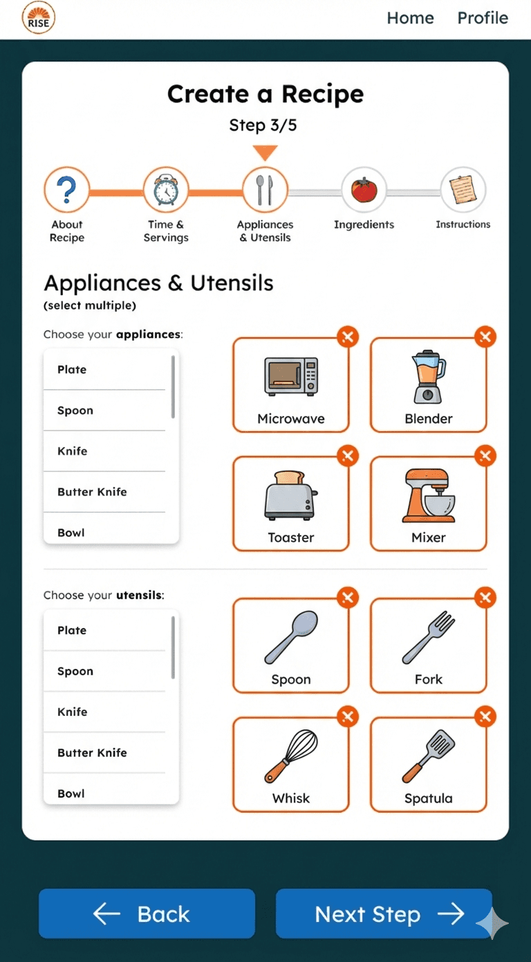
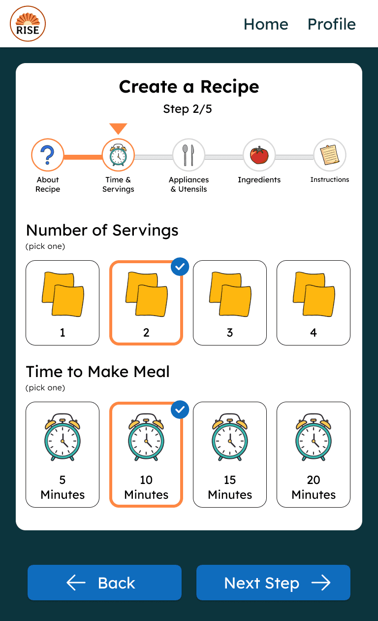
Feature 2: Adding a Recipe
Rise DC also needed a faster way to add new recipes without printing and manual updates.
Design Shift
We initially assumed the recipe creation flow could only be used by staff.
I proposed designing the experience so participants could also add their own recipes with support from staff or guardians. This aligned with Rise DC’s mission of fostering independence and created a shared experience usable by both staff and participants.
Testing & Feedback
Because of the tight timeline:
I shared interactive Figma prototypes with the nonprofit for feedback
Iterated on language clarity and interaction details
My teammates presented a live demo at Microsoft’s Reston Garage, where participants tested the app in person
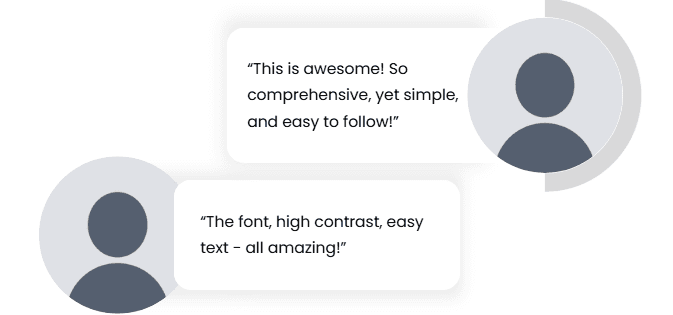
Feedback from Staff at Rise DC
Key Takeaways
Accessibility Requires Humility
I learned that designing for accessibility means listening to those with lived experience and being open to revising assumptions.
Focus on Impact Over Polish
With limited time, prioritizing usability and clarity mattered more than perfect visual refinement.
Results & Outcome
Our team delivered a scalable, accessible digital cookbook that:
Supports independent learning
Reduces cognitive overload
Enables easier recipe updates
Aligns closely with Rise DC’s mission
We validated the app through live demo testing with staff and participants at Microsoft’s Reston Garage.

Presenting the app to the kids and staff at RISE DC

